Design Prep Essentials for Designing and Sourcing Product Packaging
In packaging printing, most production issues don’t originate on press; they start much earlier, at the design preparation stage. Even the most visually compelling artwork can lead to delays, rework, or compromised results if it hasn’t been prepared with packaging structure and print behavior in mind.
Packaging artwork must align precisely with die-lines, cutting tolerances, folds, seals, and real-world handling. This guide explains how to prepare packaging art files correctly from the design stage, helping brands, designers, and agencies avoid costly revisions and move confidently into production.
Why Proper Design Preparation Is Essential for Packaging Printing Accuracy
Packaging design is not purely visual; it is a functional design engineered for production. Every packaging product is cut, folded, sealed, filled, and transported, which means artwork must perform reliably beyond the screen.
Poor design preparation commonly leads to:
- Artwork shifting after trimming or folding
- Text disappearing into seals, gussets, or edges
- Brand inconsistency across SKUs
- Prepress corrections that delay timelines
- Unexpected production costs
Well-prepared art files reduce friction between designers, printers, and manufacturing teams, allowing projects to scale smoothly, especially for repeat orders and multi-SKU packaging programs.
Why Using a Printer-Approved Die-Line Is Mandatory for Packaging Artwork
The die line is the structural blueprint for your packaging. It defines where material will be cut, folded, glued, sealed, or perforated, and it must be treated as a technical reference, not a design suggestion.
Design preparation should always begin with a final, printer-approved die-line, whether you’re working on custom stand-up pouches for food, coffee, supplements, and cosmetic brands, subscription boxes, printed product packaging used for retail packaging and e-commerce fulfillment, eco-friendly boxes and packaging, luxury rigid boxes for gift packaging, and custom-printed product labels for cosmetics and food products.
Best practices for die-lines:
- Keep die-lines on a separate, locked layer.
- Do not resize, stretch, redraw, or recreate them.
- Never design “to fit later.”
- Do not include die-lines in the final printable artwork unless requested.
Modifying a die-line - even slightly - can result in misaligned artwork or unusable packaging during production.
What are Bleed, Trim, and Safe Zones in Packaging Design?
Packaging printing involves mechanical cutting and forming, which introduces small but unavoidable tolerances. Bleed and safe zones exist to absorb those variations.
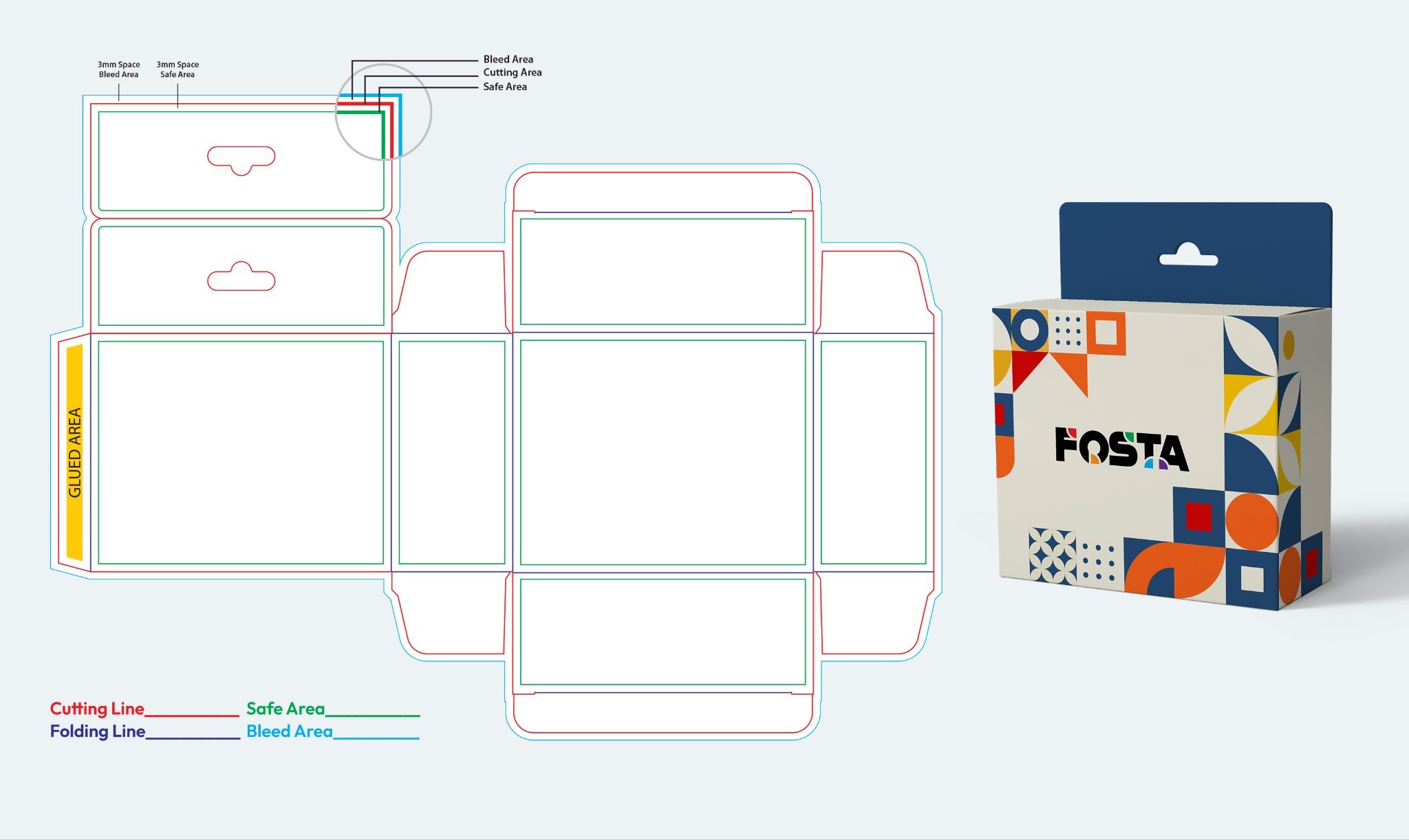
Bleed ensures that background colors and images extend beyond the cut line so no white edges appear after trimming. Safe zones protect logos, text, and critical elements from being cut, folded, or sealed.
Industry-standard guidance:
- Bleed: minimum 3 mm (0.125") on all sides
- Keep key content well inside trim lines
- Avoid placing text near folds, zippers, tear notches, or gussets
Designs that push content too close to the edges often look fine on screen but fail in production.
How Packaging Structure Affects Artwork After Printing and Forming
Packaging is rarely flat in real life. Stand-up pouches expand, cartons fold, gussets distort, and surfaces curve once filled. Design preparation must account for how the artwork behaves after forming.
Front panels should instantly communicate brand and product value. Back panels must remain readable after folding. Side panels and gussets should be handled with care, as artwork in these areas may stretch or distort.
Experienced packaging designers visualize the assembled package, not just the flat die-line. Using mockups or 3D previews at the design stage helps identify layout issues early.
How to Set Up Colors Correctly During the Packaging Design Stage
While final color control happens in prepress, design preparation sets the foundation.
Packaging artwork should always be created in CMYK color mode, not RGB. RGB colors may appear vibrant on screen, but often shift unpredictably when converted to print.
Design-stage color best practices include:
- Working in CMYK from the start
- Using consistent color builds across panels
- Extending background colors fully into the bleed area
- Handling gradients carefully to avoid banding
Early CMYK setup reduces surprises later and improves color consistency across SKUs.
Image Resolution and Placement Requirements for Packaging Artwork
Packaging printing demands higher image standards than web or social media. Images must be placed at the final print size with a minimum resolution of 300 DPI. Scaling images up in layout software reduces effective resolution and cannot be corrected later.
Images should also respect the packaging structure. Important visual details should not cross folds, seams, or gussets unless intentionally designed to do so.
Low-resolution images are among the most common and costly design preparation errors.
Typography Guidelines for Readable Packaging Printing
Typography must remain legible under real-world conditions, including retail lighting, shelf spacing, curved surfaces, and material texture.
Design preparation should avoid ultra-thin fonts, overly condensed typefaces, or tight spacing. Small text that looks acceptable on screen may become unreadable in print.
General guidelines:
- Positive text (dark on light): 6 pt or larger to maintain clarity after printing.
- Reverse text (light on dark): 8 pt or larger to prevent ink spread and loss of detail.
- Contrast and spacing: Ensure sufficient contrast and spacing so text remains readable across materials and packaging structures.
Clear typography supports both usability and compliance, even before regulatory content is added.
How to Organize Packaging Design Files for Prepress and Production
Well-organized design files reduce errors and speed up prepress review. When packaging files move between designers, pre-press, and printing teams, clarity matters.
Design files should:
- Use clearly named layers
- Remove unused or hidden elements
- Keep artwork within the artboard
- Embed linked assets
Clean file structure is not optional; it is a production requirement.
Final Artwork Checks Before Submitting Packaging Files for Printing
Before submitting art files, conduct a structured review focused on design preparation, not aesthetics alone.
Check that:
- Artwork aligns precisely with the die-line
- Bleed is present on all sides
- Text remains within safe zones
- Images meet resolution requirements
- Layout is consistent across panels
Most packaging delays originate from issues that could have been caught at this stage.
Most Common Packaging Design Preparation Mistakes and How to Avoid Them
Many packaging projects encounter delays or quality issues not because of printing errors, but due to avoidable design preparation mistakes made early in the process. These issues often recur across industries and packaging formats, especially when artwork is treated as standard print design rather than as production-ready packaging.
|
Common Mistake |
Why It Causes Problems |
How to Avoid It |
|---|---|---|
|
Designing without a finalized die-line |
Artwork may not align with cuts, folds, seals, or gussets, leading to misprints or unusable packaging |
Always start with a printer-approved die-line and design strictly within its boundaries |
|
Ignoring bleed requirements |
Background colors or images may leave white edges after trimming |
Apply a minimum 3 mm (0.125") bleed on all sides of the artwork |
|
Using low-resolution images |
Images appear blurry or pixelated when printed |
Use images at 300 DPI at the final print size and avoid upscaling |
|
Overcrowding packaging panels |
Reduces readability and weakens brand communication |
Prioritize clarity and hierarchy; keep layouts clean and focused |
|
Placing text too close to edges or folds |
Text may be cut off, distorted, or hidden after forming |
Keep text within defined safe zones, away from folds and seals |
|
Designing for appearance only |
Artwork may fail once the package is filled or handled |
Design with the final formed package in mind, not just the flat layout |
|
Poor file organization |
Increases risk of missing elements or production errors |
Use clear layer names, remove unused elements, and embed assets |
Conclusion: Design Preparation Drives Packaging Success
Successful packaging printing starts long before production; it starts with well-prepared design files. When artwork is created with structure, tolerances, and real-world use in mind, projects move faster, cost less, and deliver consistent results.
Brands that invest in proper design preparation reduce revisions, protect brand integrity, and scale packaging programs more efficiently across products and markets.
If you’re unsure whether your artwork is production-ready, reviewing design preparation early can prevent costly issues later.
Frequently Asked Questions About Packaging Design Preparation
Q: What is design preparation in packaging printing?
A: Design preparation in packaging printing refers to setting up artwork correctly before production, including alignment with die-lines, bleed, safe zones, image resolution, typography, and file structure. Proper design preparation ensures the artwork prints accurately, forms correctly, and avoids costly revisions during prepress.
Q: Why can’t packaging artwork be designed like regular print files?
A: Packaging artwork must account for cutting, folding, sealing, and forming, which do not apply to standard print materials. Regular print files often omit die lines, tolerances, and structure, resulting in misaligned artwork or unusable packaging upon production.
Q: What file setup mistakes cause the most delays in packaging printing?
A: The most common causes of delay include missing or incorrect die-lines, insufficient bleed, low-resolution images, text placed too close to edges or folds, and poorly organized files. These issues typically require redesign or reapproval, extending production timelines.
Q: How can brands ensure packaging artwork is production-ready?
A: Brands can ensure production-ready artwork by using printer-approved die-lines, designing in CMYK, maintaining proper bleed and safe zones, using high-resolution images, and organizing files clearly. Early review with a packaging or prepress specialist further minimizes risk.
Professional Design & Printing Services
Printingblue offers customized commercial printing solutions to meet your business needs. Our expert team delivers top-notch design and printing services that exceed expectations. Contact us today for a free consultation.